How To: Accessing Live NBA Play-By-Play Data
September 4, 2021Translating Owen Phillips Code from R to Python
For those NBA Data fans that are not subscribed to Owen Phillips F5 newsletter, stop what you’re doing and check it out. He shares charts and visualizations of NBA-related data each week. They are certainly something to behold. The best part is, he walks through how he creates these visualizations by posting R tutorials.
If you’re like me, you’re super grateful to see any how-to post related to NBA data. But if you’re also like me, the R code may go over your head since you only know Python…
Alas, have no fear. We’re going to take one of his recent posts and translate the R code to Python as best we can. I will go paragraph by paragraph. The only major hiccup is the ridgeline plot at the end. It appears R is far ahead of Python in this area. You can check out my code on GitHub here.
Today’s tutorial is going to go over how I got the data on timestamps during NBA games to measure how long Giannis Antetokounmpo spends at the free throw line relative to the rest of the league. I’ll also spend some time going over the code for the accompanying visualization.
Let’s start off by loading some packages and setting up a custom theme that we’ll use for our chart.
import requests
import pandas as pd
import numpy as np
import io
from nba_api.stats.static import teams
from nba_api.stats.endpoints import leaguegamefinder
import matplotlib.pyplot as plt
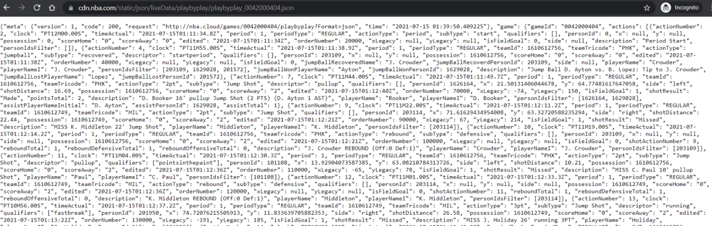
from joypy import joyplotThe data we’re going to work comes from the NBA’s live play-by-play logs (this is a different data source than the traditional play-by-play logs that we’ve worked with in the past). Here’s an example of the data, which is the live play-by-play data for Game 4 of the Finals between the Bucks and Suns.
The data, like most stuff on stats.nba.com, is stored in JSON format. To get the data in more traditional format, like a dataframe, we just need to run a few lines of code in Python. But first, we need to specify some headers in advance so that when we make a request to the NBA’s API we don’t get timed out (h/t Ryan Davis).
headers = {
'Connection': 'keep-alive',
'Accept': 'application/json, text/plain, */*',
'x-nba-stats-token': 'true',
'User-Agent': 'Mozilla/5.0 (Macintosh; Intel Mac OS X 10_14_6) AppleWebKit/537.36 (KHTML, like Gecko) Chrome/79.0.3945.130 Safari/537.36',
'x-nba-stats-origin': 'stats',
'Sec-Fetch-Site': 'same-origin',
'Sec-Fetch-Mode': 'cors',
'Referer': 'https://stats.nba.com/',
'Accept-Encoding': 'gzip, deflate, br',
'Accept-Language': 'en-US,en;q=0.9',
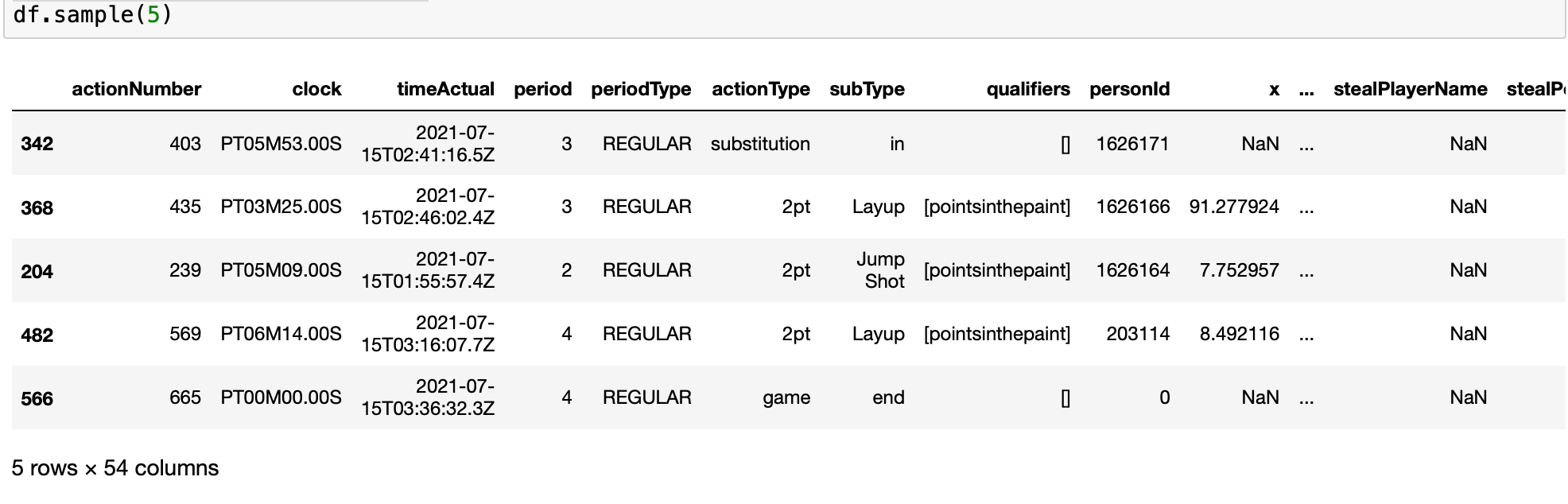
}The following code uses the headers we specified and extracts the play-by-play data and stores it in a dataframe called df.play_by_play_url = "https://cdn.nba.com/static/json/liveData/playbyplay/playbyplay_0042000404.json"
response = requests.get(url=play_by_play_url, headers=headers).json()
play_by_play = response['game']['actions']
df = pd.DataFrame(play_by_play)Here’s a snapshot of what it should look like:
To make our chart we need the play-by-play data for every game from the regular season. The fastest way to get all the data is with a function. But first, we need to get a list of all the game IDs from this season, which we can get with {nap_api} package.
So lets get all the game IDs and then create our function for getting the play-by-play data.
# get game logs from the reg season
gamefinder = leaguegamefinder.LeagueGameFinder(season_nullable='2020-21',
                                              league_id_nullable='00',
                                              season_type_nullable='Regular Season')
games = gamefinder.get_data_frames()[0]
# Get a list of distinct game ids
game_ids = games['GAME_ID'].unique().tolist()

# create function that gets pbp logs from the 2020-21 season
def get_data(game_id):
    play_by_play_url = "https://cdn.nba.com/static/json/liveData/playbyplay/playbyplay_"+game_id+".json"
    response = requests.get(url=play_by_play_url, headers=headers).json()
    play_by_play = response['game']['actions']
    df = pd.DataFrame(play_by_play)
    df['gameid'] = game_id
    return df
Now we just need to run every game ID through this function and store the results in one giant dataframe.
After that, we’re going to find all the instances of free throw attempts in our data and calculate how much time elapsed from when the player attempted their free throw from whatever action that preceded the free throw.
Note that these two steps (particularly the first one) take a few minutes to run and if you don’t want to wait that long, just download the cleaned data I already uploaded to GitHub.
# get data from all ids (takes awhile)
pbpdata = []
for game_id in game_ids:
    game_data = get_data(game_id)
    pbpdata.append(game_data)
df = pd.concat(pbpdata, ignore_index=True)

# calculate time elapsed between a free throw and whatever action came before it
df = df.sort_values(by=['gameid', 'orderNumber'])
df['dtm'] = df['timeActual'].astype('datetime64[s]')
df['ptm'] = df['dtm'].shift(1)
df['elp'] = (df['dtm'] - df['ptm']).astype('timedelta64[s]')
df['pact'] = df['actionType'].shift(1)
df['psub'] = df['subType'].shift(1)
df['pmake'] = df['shotResult'].shift(1)
df[df['actionType'] == "freethrow"]
df[df['elp'] > 0]
df = df[['gameid',
                     'clock',
                     'actionNumber',
                     'orderNumber',
                     'subType',
                     'pact',
                     'psub',
                     'dtm',
                     'ptm',
                     'pmake',
                     'elp',
                     'personId',
                     'playerNameI',
                     'shotResult',
                     'period']]

###

# read in cleaned data from GitHub, if you want
url = "https://raw.githubusercontent.com/Henryjean/data/main/cleanpbplogs2021.csv"
response = requests.get(url).content
df = pd.read_csv(io.StringIO(response.decode('utf-8')))
The last of bit of data wrangling we need to do before making our chart is limit our dataset so that we’re only looking at the time in between consecutive free throw attempts. In other words, we don’t care how much time elapsed between a shooting foul and a player’s first free throw. Nor do we care about instances where a substitution occurred in between a player’s first and second free throw. So I’m just going to look at instances where the previous action was also a free throw.
In this step we’re also going to calculate the number of observations we have for each player and the average amount of time that elapsed between their consecutive attempts. We’ll limit our data so that we’re only looking at players that we have at least 50 observations for.
# filter df down to free throw attempts
df = df[(
    ((df.subType == '2 of 2') & ((df.psub == '1 of 2') | (df.psub == 'offensive'))) |
    ((df.subType == '2 of 3') & ((df.psub == '1 of 3') | (df.psub == 'offensive'))) |
    ((df.subType == '3 of 3') & ((df.psub == '2 of 3') | (df.psub == 'offensive')))
    )]

# find average time elapsed between 1st and 2nd (or 2nd and 3rd) FTs when previous action was a FT

# get the count so we can filter for those with > 50
df['avgtime'] = df.groupby(['playerNameI', 'personId']).elp.transform('mean')
df['count'] = df.groupby(['playerNameI', 'personId']).elp.transform('count')
df = df[df['count'] > 50]
df = df.sort_values(['avgtime', 'playerNameI'], ascending=True)
It’s chart time.
This is where we are going to go in a different direction. It doesn’t appear Python has the same support for ridgeline plots so we will do our best with Joypy.
names = df['playerNameI'].unique().tolist()
plt.figure()

joyplot(
    data=df[['elp', 'avgtime', 'playerNameI']],
    by=('avgtime'),
    x_range=(0,40),
    labels=names,
    figsize=(12,8)
    )

plt.title('Real Time Elapsed Between Consecutive Free Throw Attempts', fontsize=20)
plt.show()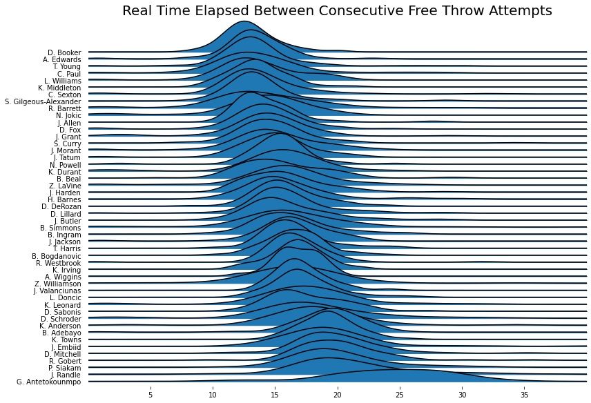
Not bad! I tried for the life of me to flip the ordering of the chart but was unable to figure it out. Feel free to drop a note in the comments if you can figure it out.
I hope you enjoyed this post. Once again, big shoutout to Owen Phillips who did all the hard work. I just spent a weekend translating his code to make it more accessible to the Python community. Be sure to check out his F5 Newsletter if you’re an NBA fan!
Cheers,
Jabe
New posts delivered to your inbox
Get updates whenever I publish something new. If you're not ready to smash subscribe just yet, give me a test drive on Twitter.